I see much of life through glass...or as it would appear through glass. Not the glass of a window, but rather through the lens of a camera. This is my photo-a-day blog for 2009.
Sunday, January 11, 2009
January 11, 2009
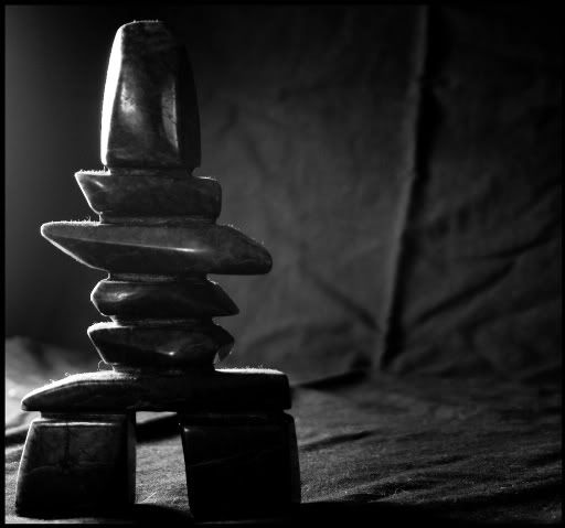
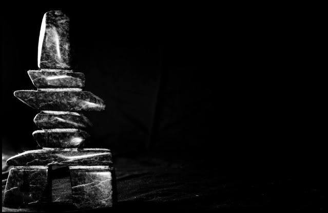
Inukshuk - couldn't decide which to share, so you get to see both :)
Wow, they both have neat character in themselves. I see the dilemma.
1. I like the side lighting and edge effect. But I don't like how the background shows. The composition is nice. I also feel a slight out of focus and if that was solid, it might be perfect.
2. I like the pattern coming out. I'm mixed about the glare but I do think it enhances the shapes. I don't like the total offset to the left nature. It's a little off balance.
Maybe you can explore this in future, trying to combing the best of both.


2 comments:
Wow, they both have neat character in themselves. I see the dilemma.
1. I like the side lighting and edge effect. But I don't like how the background shows. The composition is nice. I also feel a slight out of focus and if that was solid, it might be perfect.
2. I like the pattern coming out. I'm mixed about the glare but I do think it enhances the shapes. I don't like the total offset to the left nature. It's a little off balance.
Maybe you can explore this in future, trying to combing the best of both.
I'm not sure the significance of the "sculpture" - but both shots are beautiful. If I had to pick a favorite, I', inclined to go with #1.
Post a Comment